Bookface 1.8 is Here!
This update has a LOT of changes and fixes in it! I think I got in everything everyone who gave me feedback asked for (check the README file "Changelog" section for details). Lots of attention paid to making buttons, tabs, and drop-down appearance consistent, and lots of new CSS variables for customization plus a new option for customizing Bookface (more on that in a moment).
Bookface 1.8 has been tested with both the current stable 2024.12 and 2025.7 Release Candidate versions.
The most obvious change you'll probably notice is that the responses below posts and comments now look completely different:
And below an Event Post:
If multiple people engaged with the post in a certain way you no longer have to click the count to see the list, it's a popover that appears on hover (active on touch devices). This is a lot cleaner and more consistent with how these are displayed on other social media platforms.
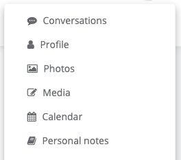
You'll also notice that the Main Menu missing icons are in place. This is a change that's coming in the next Friendica release anyway, but Bookface lets you have it right now:
Someone specifically asked whether the main navigation buttons could have labels on them:
I didn't turn it on by default, but nav button labels are now coded into Bookface and if you're using CSS variable customization they're easy to turn on:
:root {
--show-navbar-labels: block;
}
The label text is also customizable. Until now the only way to implement such customizations was either for a server admin to manually put them into the header or footer sitewide or for individual users to put them in a user content stylesheet just for your web browser. That's why I'm also releasing a new Friendica addon called "Bookface Custom" that, if your server admin installs it, allows you to customized every one of the Bookface CSS variables to your heart's content.
Get 'em while they're hot:
* Bookface 1.8
* Bookface User Styles 1.8
* Bookface Custom Addon 1.0
@Friendica Admins @Friendica Support @Friendica Developers
#Bookface #Friendica #themes #addons
Hypolite Petovan likes this.


Random Penguin
•Oh, and it's a little thing, but if you did bother to go the trouble of self-verifying your account I restyled the "verified checkmark" in the profile aside 😉:
Hypolite Petovan likes this.
Ruud
•Good work! I updated Bookface for Friendica.World.
One remark, when trying to write this comment, I tried clicking the 'comment' icon, moving the mouse from below. The new popup for the list of people that liked the post, blocked the comment button. I don't know if there's a solution for this..
Random Penguin
•Random Penguin
•Main branch updated to 1.8.1 to fix "Notices" navbar label not using CSS variable. Not an issue for anyone who isn't using Navbar Labels, which are not enabled by default.
If you don't want to wait for the next release the Main branch should always be the most current as people point out things to me and I fix them on GitLab (which should automatically get mirrored to the GitHub repo).
Random Penguin
•I agree that it does take up a lot of space, because I made the icons larger and added more white space for a cleaner, more modern look. Everything in Frio is too tiny and compact and cluttered. It doesn't help that Friendica just has a LOT of controls. Too many IMO. It's kind of overwhelming to new users.
For smaller displays when you get below 768 pixels wide it engages the mobile interface. There's some overlap between desktop and tablet landscape making it impossible to discern which it is, and for most tablets in portrait I chose to display a compact version of the desktop bars to keep the position of controls consistent if you change tablet orientation.
It is technically possible to merge the two bars into one (actually make them 50% screen width and positioned seamlessly side-by-side) for really wide screens, but there's just too much stuff there to do that for a smaller screen. And the sub-section words in the second toolbar can be really short in some languages or really long in others.
You could try zooming in until the mobile interface kicks in. Though
... show moreI agree that it does take up a lot of space, because I made the icons larger and added more white space for a cleaner, more modern look. Everything in Frio is too tiny and compact and cluttered. It doesn't help that Friendica just has a LOT of controls. Too many IMO. It's kind of overwhelming to new users.
For smaller displays when you get below 768 pixels wide it engages the mobile interface. There's some overlap between desktop and tablet landscape making it impossible to discern which it is, and for most tablets in portrait I chose to display a compact version of the desktop bars to keep the position of controls consistent if you change tablet orientation.
It is technically possible to merge the two bars into one (actually make them 50% screen width and positioned seamlessly side-by-side) for really wide screens, but there's just too much stuff there to do that for a smaller screen. And the sub-section words in the second toolbar can be really short in some languages or really long in others.
You could try zooming in until the mobile interface kicks in. Though it doesn't really save that much space as there are still two toolbars, they just aren't both at the top.