Feedback on WIP?
As some of you know I'm working implementing some of my work with the #Bookface scheme for "Frio" into a new theme based on "Vier" but incorporating some things from Frio and some new things too.
One of those things is a new icon set because Friendica's icons are looking pretty dated. You may have noticed just about everything these days has shifted to open, line icons. So I settled on Phosphor Icons because they're a really nice, free, open source set under an MIT license. I'm also using Lexend for my main font. It's scientifically designed to improve readability, looks modern, and it's based on one of my favorite old project fonts, Quicksand. Incidentally it was only after making these choices I found out Sharkey is already using this combo, so it may look familiar to some of you already.
Rather than copy ALL of the templates into the new theme to edit the icon class names, I put together a stylesheet that automatically replaces the old Font Awesome 3 and Fork Awesome 1.2 (which is based on Font Awesome 4/5) with Phosphor icons. Except for the cases where Phosphor doesn't have a viable alternative (mostly Brand and Accessibility icons). That alone really wakes things up to a modern look!
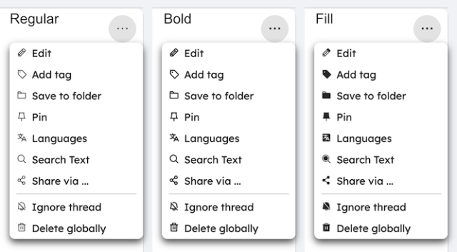
While I want this new theme to feel more light and airy, I'm leaning toward mostly using the "Phosphor-Bold" variant as the "Regular" set has pretty thin lines and looks too light next to text in the Lexend font. You can seem that in the Post Menu comparison up above. I've also considered just using the "Fill" variant for drop-down menus. If you look at Facebook they use open, line icons where they are by themselves, bolder or filled versions in circle buttons, and filled icons in drop-down menus. I may do something similar, I'm not sure. Though I like the look of the "Phosphor-Bold" in the drop-down menu. It's heavy enough to look like it goes with the Lexend text next to it, but not too heavy, which is the feel I get from the "Phosphor-Fill" icons.
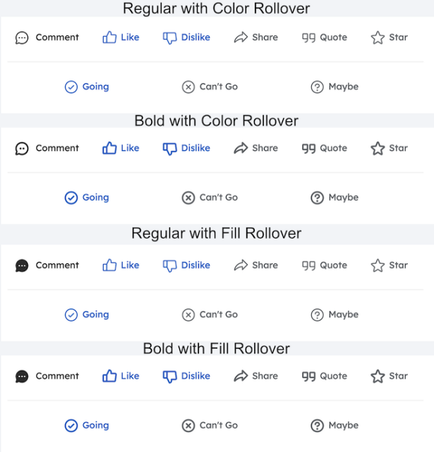
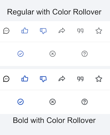
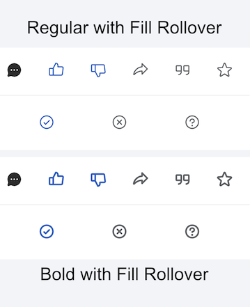
As for the "Action Buttons" you use to interact with posts, for those I'm leaning toward using "Phosphor-Regular" for those but if I do probably "Phosphor-Fill" for the rollover effect as a color change on rollover is hard to see with the thinner line width. "Active" buttons (ones you've already clicked before on that post) would be in your personal choice "Accent" color. You'll notice no little engagement counts on them either. Too many people have found them overly distracting or visually cluttering so I'm not going to do that in this new theme.
There's still no room on narrow mobile screens in portrait for the button labels, but here are the screencaps of the font weight and rollover options:
I'm sticking with the icon font instead of switching to SVG sprites because Vier uses icon fonts already and it's simply easier to retrofit it with the Phosphor Icons font.
I was initially just going to adapt the Bookface look to a new stylesheet for Vier. But it quickly became apparent to do some of the things I want I need to alter the structure of the theme not just the appearance. "Vier" is an old theme but it's proven more stable than Frio, uses fewer resources, and it loads and renders faster. Mostly because it doesn't have any frameworks or add any new JS or jQuery. "Frio" is a Bootstrap theme and has some other frameworks/libraries and is quite complex and code-heavy. For building a new theme I had to decide if I was sticking with Frio and was going to try and strip all that out or if I should just base on Vier since it already didn't have any of that in it.
As I said, what I'm making is more of a blend of Vier and Frio layout and features, but I'm also not going to add any frameworks or libraries or jQuery, though there may be a little vanilla JS just to make things work. And custom backend code to implement some things via hooks that aren't in the Friendica core.
The working theme name is BookLook though that could change.
The Work-In-Progress theme is not yet to a point where I'm posting code or sharing it for testing. It's been slow going and there's still LOTS to do! I don't have a timeline on when this will be ready for that or completed. But I finally reached the milestone (or maybe it's a millstone?) of swapping out the icons and would appreciate any thoughts you might have about the direction I'm going with it.
Hypolite Petovan likes this.


Wilhelm
•Hypolite Petovan likes this.