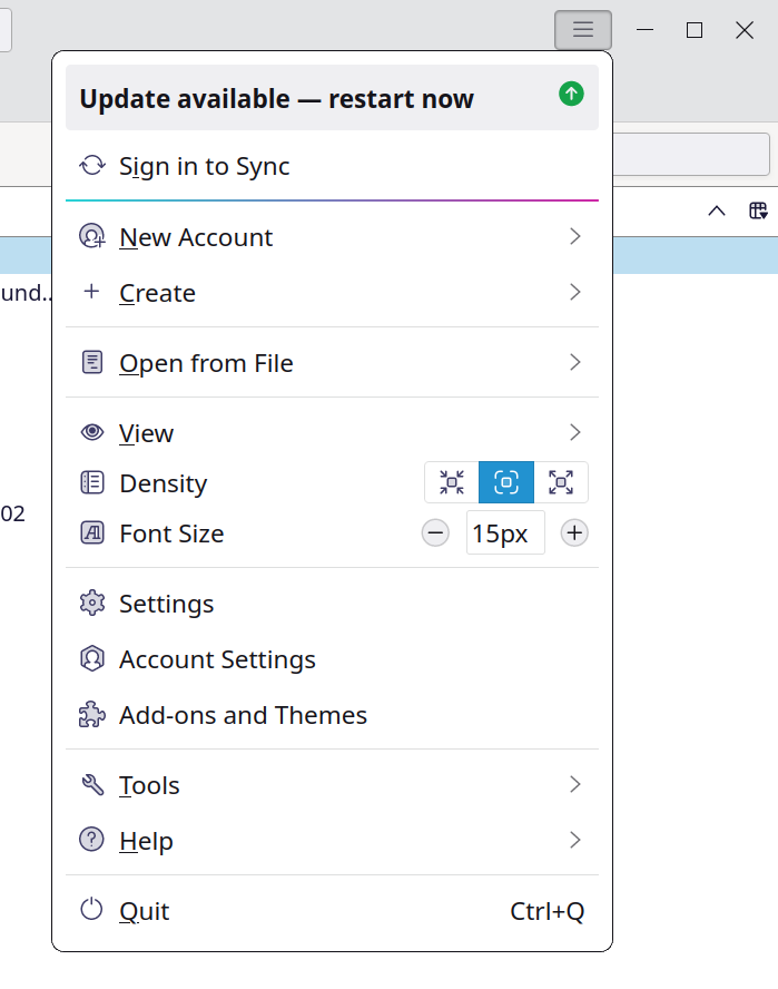
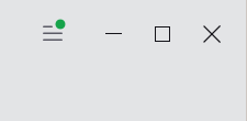
A recent #Thunderbird Daily build introduced a nice, subtle change to the Application menu, aligning it with the window action buttons.
And a small green dot indicates that an update is available.
Thoughts?
And a small green dot indicates that an update is available.
Thoughts?


Anders Rytter Hansen
•